Telematics Data Visualisation: ROI for Fleet Operators
Telematics dashboards reveal idling, route waste and fault codes to cut fuel, maintenance and incidents and show ROI at 3–12 months.
If you can’t see fleet data clearly, you usually pay for it in fuel, repairs, downtime and incidents.
I’d sum it up like this: telematics dashboards turn raw tracking data into clear actions. That means I can spot idling, route waste, fault codes, risky driving and low vehicle use early, then measure the return over 3, 6 and 12 months. The article’s main point is simple: clearer data helps cut costs and prove ROI with numbers.
Here’s the short version:
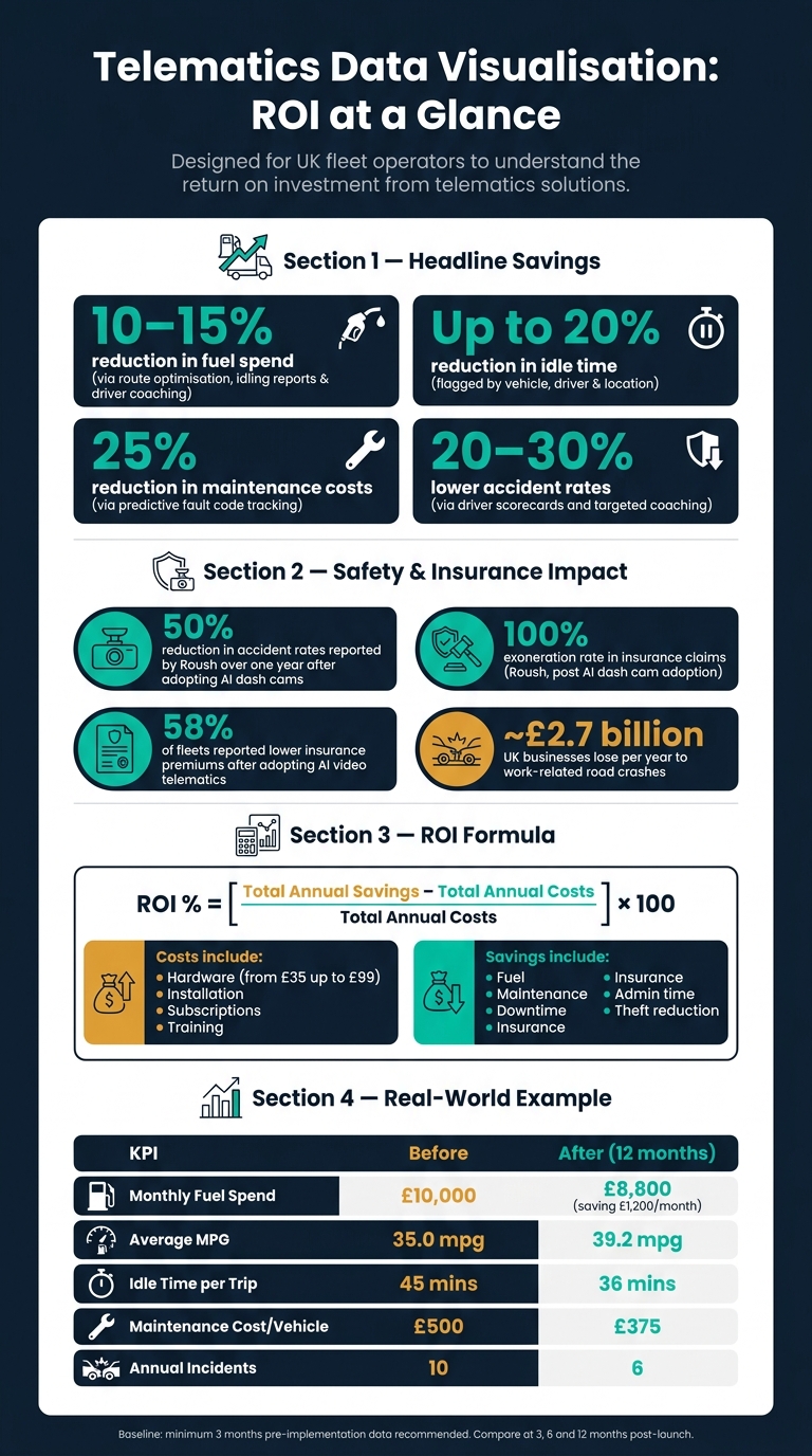
- Fuel spend can fall by 10–15% with route reviews, idling reports and driver coaching.
- Idle time can drop by up to 20% when waste is shown by vehicle, driver and location.
- Maintenance costs can fall by 25% when fault codes are tracked before breakdowns.
- Incident rates can drop, which may help with claims and insurance costs.
- A clean baseline matters: I’d track at least 3 months of pre-launch data first.
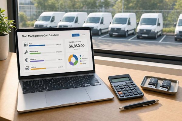
- ROI is calculated with: [(annual savings − annual costs) / annual costs] × 100.
- Annual costs usually include hardware, fitting, subscriptions, training and setup time.
- Annual savings often come from fuel, maintenance, less downtime, admin time, insurance and theft loss reduction.
A few figures stand out straight away. Work-related road crashes cost UK businesses about £2.7 billion a year. Hardware can start from around £35 and go up to £99 for more advanced units. And one sample improvement in the article shows monthly fuel spend dropping from £10,000 to £8,800.
So if you want the plain answer, it’s this: data visualisation does not create ROI on its own; it helps you find waste faster, act on it, and show what changed in pounds and pence.
Telematics ROI: Key Stats & Savings for Fleet Operators
The business problems caused by poor data visibility
How fragmented data slows decisions and creates inconsistency
Most fleets don't have a lack of data - they have data stuck in silos. GPS logs, maintenance records, and driver behaviour events often live in separate systems. When there's no single dashboard, problems stay hidden until they've already cost time and money.
By the time reports land, unsafe driving and too much idling have often gone on for far too long. One manager looks at one set of numbers, another uses a different metric, and they end up reaching different conclusions. That makes it hard for the fleet to move in the same direction.
When those problems stay out of sight, the bill turns up elsewhere: fuel spend, repair costs, and poor driving habits.
Hidden costs in fuel, maintenance and driver behaviour
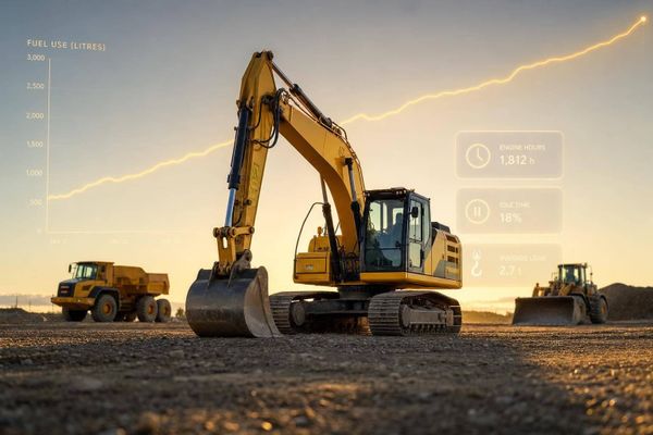
When trends are hidden, excessive idling, early fault codes, and unsafe driving can pass unnoticed. Predictive maintenance enabled by clear data visualisation can reduce maintenance expenses by 25% and fuel costs by 10–15%. Without that level of visibility, fleets deal with more emergency repairs, more unplanned downtime, and more vehicles sitting off the road.
It's a bit like driving with the dashboard lights covered up. The problem doesn't go away just because no one saw it in time.
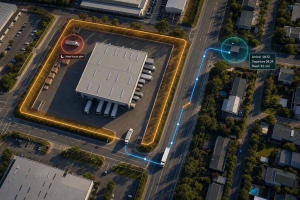
How poor visibility raises security and compliance risk
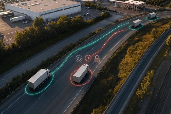
Weak data visibility leaves gaps in security and compliance. If a vehicle is used without authorisation or goes off route, a manager relying on manual reports probably won't spot it until much later. That delay increases the risk of asset loss.
Clear reporting on speeding, mobile phone use, and route deviations cuts compliance risk and supports insurance claims. Poor visibility brings a direct financial cost through risk pricing, enforcement exposure, and avoidable loss.
That is the point where visibility starts to show up as measurable return.
sbb-itb-499a7f0
How data visualisation turns telematics into measurable ROI
Cutting fuel costs through route analysis, idling reports and driver coaching
Hidden costs start to look a lot more manageable when managers can see what’s happening in the moment. live dashboards help fleet teams cut fuel spend with van tracker systems, idling reports and driver coaching. With live traffic data, they can steer drivers away from congestion, detours and extra miles that quietly eat into margins.
Idling is another area where waste can slip by if you’re only looking at raw data. AI tools flag excessive idling by vehicle, driver and location, which means managers can deal with the exact issue instead of sending the same message to everyone. Add driver scorecards into the mix, and speed, braking and acceleration data become simple visual feedback that teams can actually use. That makes coaching sessions more focused and based on proof, not guesswork. AI-powered telematics can cut fuel consumption by 10–15% and idle time by up to 20%.
Reducing downtime, improving driver safety and balancing vehicle use
The same level of visibility helps cut downtime too. Predictive maintenance dashboards surface early fault codes before they turn into breakdowns, which can lower both downtime and repair spend. Predictive analytics can reduce maintenance costs by 25%.
Visual feedback also has a clear effect on driver safety. When scorecards show driver rankings and flag behaviours like harsh braking, speeding and phone use, the feedback loop gets much tighter. Teams can spot patterns fast and coach with specifics. Roush reported a 50% reduction in accident rates over one year and a 100% exoneration rate in insurance claims after adopting AI dash cams. On top of that, 58% of fleets reported lower premiums after adopting AI video telematics.
Utilisation heatmaps and trend graphs add another layer. They show which vehicles are under pressure and which are sitting idle, helping managers spread workloads more evenly and spot underused assets before money is wasted.
Comparison table: visualisation features, operational benefits and financial impact
| Visualisation Feature | Operational Benefit | Potential Financial Impact |
|---|---|---|
| Real-time Maps | Dynamic route adjustment based on traffic and weather | 10–15% reduction in fuel spend |
| Idling Reports | Identifies wasted fuel and unnecessary engine wear | 20% reduction in idle time |
| Driver Scorecards | Targeted coaching for speeding and harsh braking | 20–30% lower accident rates |
| Maintenance Alerts | Predictive detection of engine faults and early fault codes | 25% reduction in repair costs |
| Utilisation Heatmaps | Balances vehicle workloads and identifies idle assets | Higher vehicle utilisation and lower capital waste |
How to calculate ROI from telematics dashboards
A simple ROI formula with clear cost and savings inputs
Once dashboards start cutting waste, the next job is to show the return in pounds and pence.
You can do that with a simple formula:
ROI % = [(Total Annual Savings − Total Annual Costs) / Total Annual Costs] × 100
Total Annual Costs include hardware, installation, subscriptions, training and implementation time. Hardware starts at £35, while advanced units with immobilisation can cost up to £99. Dashboards help here because they make these inputs visible, auditable and easy to compare over time.
Total Annual Savings cover fuel reduction, maintenance savings, lower downtime, insurance premium reductions, less admin time and avoided theft-related losses.
Tracking baseline and post-implementation KPIs over fixed periods
Before launch, use the dashboard to build a clean baseline. Record at least three months of pre-implementation data, including monthly fuel spend, average mpg, idle minutes per trip, maintenance cost per vehicle and incident count.
Once the system is live, compare performance at 3, 6 and 12 months. Looking at more than one checkpoint helps account for seasonal changes in fuel use and maintenance demand.
Comparison table: baseline vs post-implementation performance
Here’s what baseline vs 12-month results can look like:
| KPI | Baseline (Pre-Implementation) | Post-Implementation (12 Months) | Financial Impact |
|---|---|---|---|
| Fuel Spend (Monthly) | £10,000 | £8,800 (12% reduction) | £1,200 monthly saving |
| Average MPG | 35.0 mpg | 39.2 mpg | 4.2 mpg gain |
| Average Idle Time per Trip | 45 mins | 36 mins (20% reduction) | Lower engine wear and fuel waste |
| Maintenance Cost per Vehicle | £500 | £375 (25% reduction) | £125 saving per vehicle |
| Number of Incidents (Annual) | 10 | 6 (40% reduction) | Lower insurance and repair costs |
Without a clean baseline, it’s hard to prove savings.
With the return measured, the next step is choosing the right KPIs and review process.
Putting visual dashboards to work in a UK fleet
Choosing the right tracking data, KPIs and review process
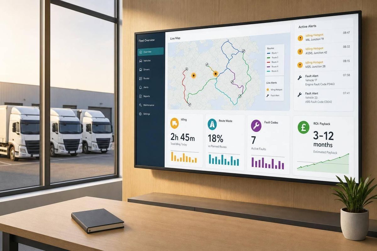
Set up separate dashboard views for operations, maintenance and safety. That way, each team sees the numbers it can actually use, instead of wading through data that means little to their day-to-day work.
For operations, focus on route efficiency, idling time and fuel efficiency. For maintenance, watch engine fault codes so repairs can be booked before a vehicle breaks down. For safety, track speeding, harsh braking and driver scores. Each dashboard should link to a clear business goal, such as cutting fuel spend, improving uptime or reducing incident rates.
The review rhythm matters too. Safety alerts should be checked weekly, while performance trends make more sense as a monthly review. If the team only looks at the dashboard now and then, useful data can slip through the cracks.
That process depends on one thing: reliable live data.
Where GRS Fleet Telematics fits into the ROI picture
Accurate KPIs start with tracking data you can trust. GRS Fleet Telematics provides live tracking, geofencing and driver behaviour data for UK fleets. Its dual-tracker setup helps keep vehicles visible if one device is tampered with or stops working. GRS Fleet Telematics reports a 91% recovery rate for stolen vehicles in the UK.
Conclusion: clearer data, faster decisions, stronger fleet returns
When a dashboard is linked to clear KPIs, ROI shows up in everyday decisions. Fleets that build clean baselines, set role-based KPIs and review performance on a regular cycle can cut fuel and maintenance costs, reduce incident rates and improve asset security. Clear dashboards turn fuel use, downtime, safety and security into measurable fleet gains.
Fleet Analytics Improves ROI, Efficiency, & Safety
FAQs
How quickly can telematics dashboards deliver ROI?
Telematics dashboards can pay for themselves fast. Some fleet operators see payback in as little as 0.3 months, though that depends on fleet size and the features they use.
For most fleets, a full return on investment usually comes within 6 to 12 months.
Which KPIs should I track first?
Start with three core areas: efficiency, delivery performance and driver safety.
- Efficiency: fuel use and vehicle idle time
- Delivery performance: on-time delivery rate
- Driver safety: harsh braking, rapid acceleration and speeding
Check these each week so you can adjust your approach, cut downtime and improve ROI.
How do I prove savings accurately?
Set a clear baseline before implementation. Track the same metrics for 4 to 8 weeks, such as fuel cost per mile, total miles driven, failed delivery rates and overtime hours.
Once the system is live, compare those same measures to see what changed. To keep the numbers clean, check GPS data, odometer entries and fuel usage against source records. Also look out for duplicate entries or reports that don't line up.